How do plot data in pie (or) bar charts using Python ready-to-use function?
Install the following module(s) if you haven’t installed them already:
pip install matplotlibReady-to-use Python function to plot data in a Pie (or) Bar chart:
def plot_chart(PlotValue, PlotLabel, chart_type, plot_heading='', PlotColor=[]):
    # Plot Pie or Bar or Barh chart
    plt.clf()
    plot_color = True

    # set font size
    # font = {'size': 9}
    # plt.rc('font', **font)

    # No Data message
    if len(PlotValue) < 1:
        messagebox.showinfo('Message', 'No Data to Plot!')
        return

    if len(PlotValue) != len(PlotLabel):
        messagebox.showinfo('Message', 'List size of Value and Label are not matching!')
        return

    if len(PlotValue) != len(PlotColor):
        if len(PlotColor) < 1:
            plot_color = False
        else:
            messagebox.showinfo('Message', 'List size of Value and Color are not matching!')
            return

    # rename labels with PlotValue
    for i in range(0, len(PlotLabel)):
        PlotLabel[i] = str(PlotLabel[i]) + ' (' + str(PlotValue[i]) + ')'

    # Plot Pie Chart
    if chart_type == 'pie' or chart_type == 'Pie' or chart_type == 'PIE':
        if plot_color == True:
            plt.pie(PlotValue, labels = PlotLabel, colors = PlotColor, shadow = True, startangle = 90, autopct='%1.1f%%', pctdistance=0.5, labeldistance=1.1, wedgeprops = {"edgecolor" : "white", 'linewidth': 0.5,'antialiased': True})
        elif plot_color == False:
            plt.pie(PlotValue, labels = PlotLabel, shadow = True, startangle = 90, autopct='%1.1f%%', pctdistance=0.5, labeldistance=1.1, wedgeprops = {"edgecolor" : "white", 'linewidth': 0.5,'antialiased': True})

    # Plot Vertical Bar Chart
    if chart_type == 'bar' or chart_type == 'Bar' or chart_type == 'BAR':
        if plot_color == True:
            pps = plt.bar(PlotLabel, PlotValue, color = PlotColor)
        elif plot_color == False:
            pps = plt.bar(PlotLabel, PlotValue)

        for p in pps:
            height = p.get_height()
            width = p.get_width()
            PerValue = round(height/sum(PlotValue) * 100, 1)
            plt.text(x=p.get_x() + width / 2, y=height+.10, s="{}%".format(PerValue), ha='center')

    # Plot Horizantal Bar Chart
    if chart_type == 'barh' or chart_type == 'Barh' or chart_type == 'BARH':
        if plot_color == True:
            pps = plt.barh(PlotLabel, PlotValue, color = PlotColor)
        elif plot_color == False:
            pps = plt.barh(PlotLabel, PlotValue)

        for p in pps:
            width = p.get_height()
            height = p.get_width()
            PerValue = round(height/sum(PlotValue) * 100, 1)
            plt.text(y=p.get_y() + width / 2, x=height+.10, s="{}%".format(PerValue), ha='left')

    plt.title(plot_heading)
    plt.tight_layout()
    plt.show()
Write your main code as a sample below,
import matplotlib.pyplot as plt
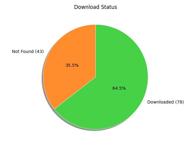
plot_chart([43, 78], ["Not Found", "Downloaded"], 'pie', "Download Status", ["#ff8c2d", "#47d147"])
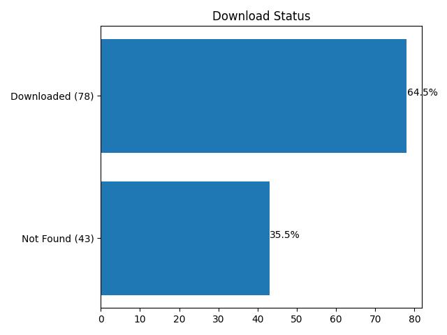
plot_chart([43, 78], ["Not Found", "Downloaded"], 'barh', "Download Status")The output of the code is,
How does the function work?
This code is a Python function to plot a chart using the Matplotlib library. The function takes in the following arguments:
- The
PlotValue: A list of values to be plotted in the chart. - The
PlotLabel: A list of labels for each value to be plotted. - The
Chart_type: The type of chart to be plotted. The options are ‘pie’, ‘bar’ or ‘barh’ (vertical bar chart, or horizontal bar chart, respectively). - The
Plot_heading(Optional): The title of the chart. - The
PlotColor(Optional): A list of colors for each value to be plotted.
The function starts by clearing any existing plot on the figure. Then, it checks the length of the PlotValue, PlotLabel, and PlotColor lists to make sure that they have the same length. If the length of the PlotColor list is less than 1, the plot_color variable is set to False, indicating that colors won’t be used in the plot. If the lengths of the lists are not equal, a message box is shown with an error message.
The function then renames the PlotLabel list by adding the corresponding PlotValue for each label.
Next, the function checks the value of the chart_type argument and plots the chart accordingly. If chart_type is pie, a pie chart is plotted using the PlotValue and PlotLabel lists, and the colors are set using the PlotColor list if plot_color is True.
If chart_type is bar or barh, a bar or horizontal bar chart is plotted, respectively, using the PlotLabel and PlotValue lists. If plot_color is True, the colors are set using the PlotColor list. In both cases, the function adds the percentage values for each bar on the plot.
Finally, the function sets the title of the chart to the plot_heading argument and displays the chart using the plt.show() function.
Leave a Reply